Data Analysis/visualization
[Python] y축 2개를 이용한 산점도 + 추세선 그리기(&그룹별 색상)
Woomii
2022. 2. 10. 19:09
728x90
반응형
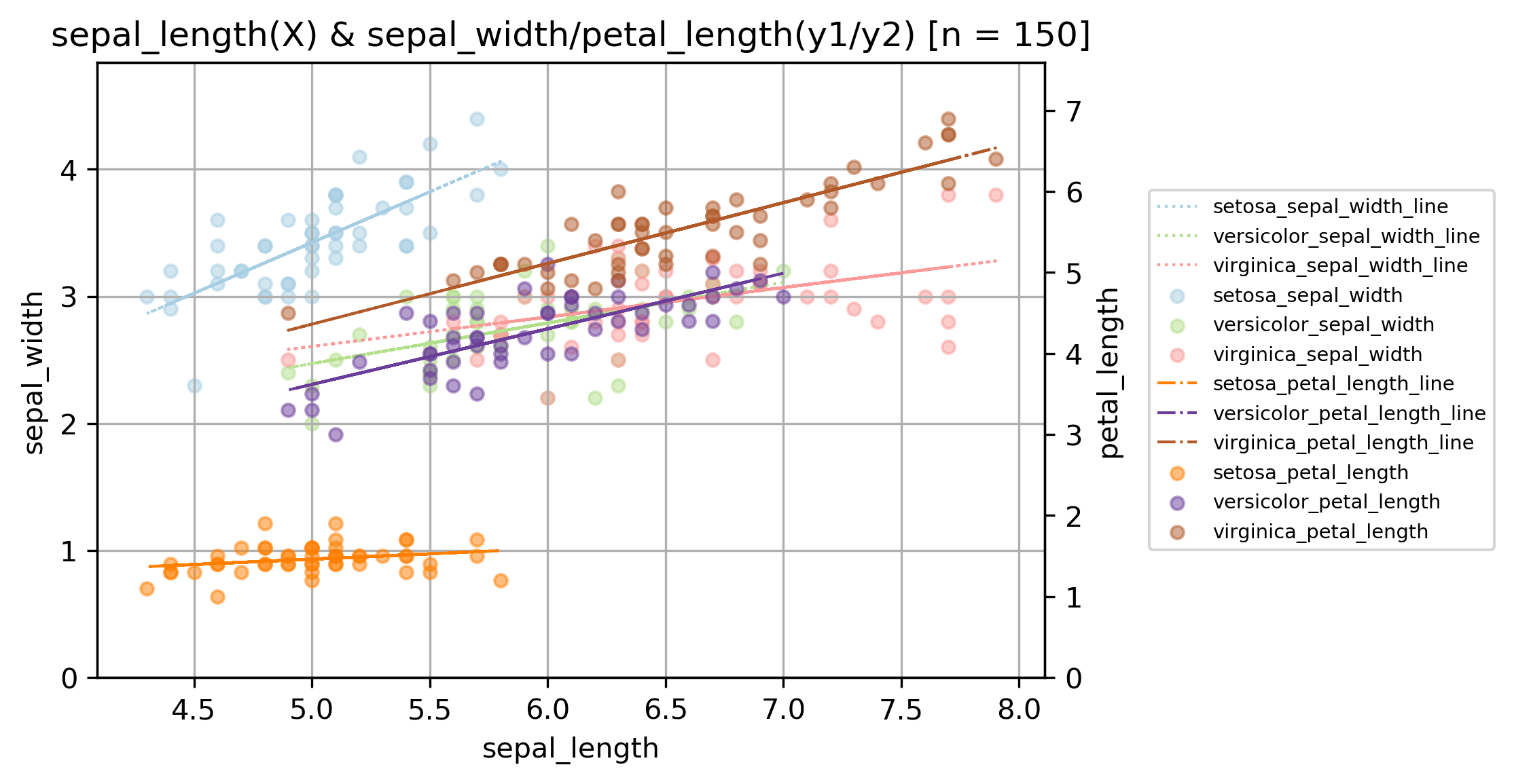
이번 코드는 위의 산점도와 같이 X축을 중심으로 좌측에 y1, 우측에 y2 2개의 y축을 그리고,
각 그룹별로 색상을 다르게 해서 산점도를 그린 후
산점도 위에 그룹+변수별 추세선을 그리고,
가독성을 위해 그래프 바깥에 범례를 반영한 그래프를 그리기 위한 코드입니다.
이번에도 샘플 데이터로 iris 데이터셋을 사용합니다.
iris 데이터셋을 불러오고 전처리 하는 과정은 아래 링크와 같습니다.
https://woomii.tistory.com/19
[Python] iris dataset load & pre-processing
이번 글에서는 iris dataset을 sklearn 라이브러리를 이용해 불러오고, 데이터 분석에 사용하기 적절한 형태인 판다스 데이터 프레임형태로 바꾸어 주는 코드에 대해 소개합니다. 먼저, iris dataset 로
woomii.tistory.com
먼저 필요한 라이브러리를 로드합니다.
# Load library
import pandas as pd
import numpy as np
import matplotlib.pyplot as plt
import os from sklearn.datasets

import load_iris # scikit-learn iris 데이터셋 로드
다음으로 iris 데이터셋을 불러오고 사용하기 알맞은 형태로 전처리합니다.
# iris data set 준비

iris = load_iris() # sample data load
# label print(iris.target)
print(iris.target_names) # feature_names 와 group을 컬럼으로 갖는 데이터프레임 생성

df = pd.DataFrame(data=iris.data, columns=iris.feature_names)
df['group'] = iris.target # 0.0, 1.0, 2.0으로 표현된 label을 3개의 group 문자열로 매핑

df['group'] = df['group'].map({0:"setosa", 1:"versicolor", 2:"virginica"})
print(df)

df.columns = ['sepal_length', 'sepal_width', 'petal_length', 'petal_width', 'group'] # 데이터 프레임 컬럼명 수정

print(df)
# [0 0 0 0 0 0 0 0 0 0 0 0 0 0 0 0 0 0 0 0 0 0 0 0 0 0 0 0 0 0 0 0 0 0 0 0 0
# 0 0 0 0 0 0 0 0 0 0 0 0 0 1 1 1 1 1 1 1 1 1 1 1 1 1 1 1 1 1 1 1 1 1 1 1 1
# 1 1 1 1 1 1 1 1 1 1 1 1 1 1 1 1 1 1 1 1 1 1 1 1 1 1 2 2 2 2 2 2 2 2 2 2 2
# 2 2 2 2 2 2 2 2 2 2 2 2 2 2 2 2 2 2 2 2 2 2 2 2 2 2 2 2 2 2 2 2 2 2 2 2 2 2 2 2]

# ['setosa' 'versicolor' 'virginica']
# sepal length (cm) sepal width (cm) ... petal width (cm) group
# 0 5.1 3.5 ... 0.2 setosa
# 1 4.9 3.0 ... 0.2 setosa
# 2 4.7 3.2 ... 0.2 setosa
# 3 4.6 3.1 ... 0.2 setosa
# 4 5.0 3.6 ... 0.2 setosa
# .. ... ... ... ... ...
# 145 6.7 3.0 ... 2.3 virginica
# 146 6.3 2.5 ... 1.9 virginica
# 147 6.5 3.0 ... 2.0 virginica
# 148 6.2 3.4 ... 2.3 virginica
# 149 5.9 3.0 ... 1.8 virginica
# [150 rows x 5 columns]

# sepal_length sepal_width petal_length petal_width group
# 0 5.1 3.5 1.4 0.2 setosa
# 1 4.9 3.0 1.4 0.2 setosa
# 2 4.7 3.2 1.3 0.2 setosa
# 3 4.6 3.1 1.5 0.2 setosa
# 4 5.0 3.6 1.4 0.2 setosa
# .. ... ... ... ... ...
# 145 6.7 3.0 5.2 2.3 virginica
# 146 6.3 2.5 5.0 1.9 virginica
# 147 6.5 3.0 5.2 2.0 virginica
# 148 6.2 3.4 5.4 2.3 virginica
# 149 5.9 3.0 5.1 1.8 virginica
본격적으로 아래의 사용자 정의 함수를 이용해 그래프를 설정해주고,
실제로 그래프를 그려주면 완성!
(각 코드별 자세한 설명은 추후 정리할 예정입니다)
# =============================================================================
# # ScatterPlotting_2yaxis: scatter plotting with 2 y axis(y1_x_y2 format)
# =============================================================================

def ScatterPlotting_2yaxis(x, y1, y2, group, save_path='C:/',
		input_figsize=(7, 6), ssize_setting = 30, alpha_setting = 0.5, fontsize_setting = 8,
        axis_labels=('x', 'y1', 'y2')):  # axis_labels = (ycol, 'Pred_'+ycol)

    os.chdir(save_path)  # 그림 저장용 경로 설정

    fig, ax1 = plt.subplots()
    ax2 = ax1.twinx() # 2번째 y축 설정
    ax1.set_ylim(min(0, min(y1)), max(y1)*1.1) # 1번째 y축(좌측 세로축) 범위 설정
    ax2.set_ylim(min(0, min(y2)), max(y2)*1.1) # 2번째 y축(우측 세로축) 범위 설정

    ax1.grid(True)
    ax1.set_xlabel(axis_labels[0], fontsize=fontsize_setting * 0.9) # axis label setting (90% size of input font size)


    df = pd.concat([x, y1, y2, group], axis=1)
    df.columns = ['x', 'y1', 'y2', 'group']
    c_lst = [plt.cm.Paired(a) for a in np.linspace(0.0, 1.0, 2 * len(set(df['group'])))]
    group_lst = df.groupby('group', as_index=False).mean().group.tolist()
    print(df, group_lst)

    # y1
    for i, g in enumerate(df.groupby('group')):
        # calc the trendline
        z = np.polyfit(g[1]['x'].tolist(), g[1]['y1'].tolist(), 1)
        p = np.poly1d(z)

        ax1.scatter(x=g[1]['x'], y=g[1]['y1'], color=c_lst[i], label='{}_{}'.format(group_lst[i], axis_labels[1]),
                    s=ssize_setting, alpha=alpha_setting)
        ax1.plot(g[1]['x'], p(g[1]['x']), color = c_lst[i], linewidth=1, linestyle = ":", label='{}_{}_line'.format(group_lst[i], axis_labels[1]))
        ax1.set_ylabel(axis_labels[1], fontsize = fontsize_setting * 0.9) # y axis label setting (90% size of input font size)

    # y2
    for i, g in enumerate(df.groupby('group')):
        # calc the trendline
        z = np.polyfit(g[1]['x'].tolist(), g[1]['y2'].tolist(), 1)
        p = np.poly1d(z)

        ax2.scatter(x=g[1]['x'], y=g[1]['y2'], color=c_lst[i + len(set(df['group']))], label='{}_{}'.format(group_lst[i], axis_labels[2]),
                    s=ssize_setting, alpha=alpha_setting)
        ax2.plot(g[1]['x'], p(g[1]['x']), color = c_lst[i + len(set(df['group']))], linewidth=1, linestyle = "-.", label='{}_{}_line'.format(group_lst[i], axis_labels[2]))
        ax2.set_ylabel(axis_labels[2], fontsize = fontsize_setting * 0.9) # y axis label setting (90% size of input font size)

    sct1, labels1 = ax1.get_legend_handles_labels()
    sct2, labels2 = ax2.get_legend_handles_labels()
    ax2.legend(sct1 + sct2, labels1 + labels2, fontsize = 'x-small', loc='center left', bbox_to_anchor=(1.1, 0.5))

    plt.title(axis_labels[0] + '(X) & ' + axis_labels[1] + '/' + axis_labels[2] +
                     "(y1/y2) [n = " + str(len(x)) + "]", fontsize=fontsize_setting * 1.1)

    saveNm_fig = '{}_{}_{}_scatterplot_{}.png'.format(axis_labels[0], axis_labels[1], axis_labels[2], str(len(x)))

    plt.savefig(fname=saveNm_fig, dpi=300, bbox_inches='tight')
    plt.show()

ScatterPlotting_2yaxis(x = df.sepal_length, y1 = df.sepal_width, y2 = df.petal_length, group = df.group,
                       save_path='D:/', input_figsize=(7, 6), ssize_setting = 20, alpha_setting = 0.5, fontsize_setting = 11,
                       axis_labels=('sepal_length', 'sepal_width', 'petal_length'))
전체 코드
# Load library
import pandas as pd
import numpy as np
import matplotlib.pyplot as plt
import os from sklearn.datasets

import load_iris # scikit-learn iris 데이터셋 로드


# iris data set 준비

iris = load_iris() # sample data load
print(iris.target_names) # feature_names 와 group을 컬럼으로 갖는 데이터프레임 생성

df = pd.DataFrame(data=iris.data, columns=iris.feature_names)
df['group'] = iris.target # 0.0, 1.0, 2.0으로 표현된 label을 3개의 group 문자열로 매핑

df['group'] = df['group'].map({0:"setosa", 1:"versicolor", 2:"virginica"})
print(df)

df.columns = ['sepal_length', 'sepal_width', 'petal_length', 'petal_width', 'group'] # 데이터 프레임 컬럼명 수정

print(df)


# =============================================================================
# # ScatterPlotting_2yaxis: scatter plotting with 2 y axis(y1_x_y2 format)
# =============================================================================

def ScatterPlotting_2yaxis(x, y1, y2, group, save_path='C:/',
		input_figsize=(7, 6), ssize_setting = 30, alpha_setting = 0.5, fontsize_setting = 8,
        axis_labels=('x', 'y1', 'y2')):  # axis_labels = (ycol, 'Pred_'+ycol)

    os.chdir(save_path)  # 그림 저장용 경로 설정

    fig, ax1 = plt.subplots()
    ax2 = ax1.twinx() # 2번째 y축 설정
    ax1.set_ylim(min(0, min(y1)), max(y1)*1.1) # 1번째 y축(좌측 세로축) 범위 설정
    ax2.set_ylim(min(0, min(y2)), max(y2)*1.1) # 2번째 y축(우측 세로축) 범위 설정

    ax1.grid(True)
    ax1.set_xlabel(axis_labels[0], fontsize=fontsize_setting * 0.9) # axis label setting (90% size of input font size)


    df = pd.concat([x, y1, y2, group], axis=1)
    df.columns = ['x', 'y1', 'y2', 'group']
    c_lst = [plt.cm.Paired(a) for a in np.linspace(0.0, 1.0, 2 * len(set(df['group'])))]
    group_lst = df.groupby('group', as_index=False).mean().group.tolist()
    print(df, group_lst)

    # y1
    for i, g in enumerate(df.groupby('group')):
        # calc the trendline
        z = np.polyfit(g[1]['x'].tolist(), g[1]['y1'].tolist(), 1)
        p = np.poly1d(z)

        ax1.scatter(x=g[1]['x'], y=g[1]['y1'], color=c_lst[i], label='{}_{}'.format(group_lst[i], axis_labels[1]),
                    s=ssize_setting, alpha=alpha_setting)
        ax1.plot(g[1]['x'], p(g[1]['x']), color = c_lst[i], linewidth=1, linestyle = ":", label='{}_{}_line'.format(group_lst[i], axis_labels[1]))
        ax1.set_ylabel(axis_labels[1], fontsize = fontsize_setting * 0.9) # y axis label setting (90% size of input font size)

    # y2
    for i, g in enumerate(df.groupby('group')):
        # calc the trendline
        z = np.polyfit(g[1]['x'].tolist(), g[1]['y2'].tolist(), 1)
        p = np.poly1d(z)

        ax2.scatter(x=g[1]['x'], y=g[1]['y2'], color=c_lst[i + len(set(df['group']))], label='{}_{}'.format(group_lst[i], axis_labels[2]),
                    s=ssize_setting, alpha=alpha_setting)
        ax2.plot(g[1]['x'], p(g[1]['x']), color = c_lst[i + len(set(df['group']))], linewidth=1, linestyle = "-.", label='{}_{}_line'.format(group_lst[i], axis_labels[2]))
        ax2.set_ylabel(axis_labels[2], fontsize = fontsize_setting * 0.9) # y axis label setting (90% size of input font size)

    sct1, labels1 = ax1.get_legend_handles_labels()
    sct2, labels2 = ax2.get_legend_handles_labels()
    ax2.legend(sct1 + sct2, labels1 + labels2, fontsize = 'x-small', loc='center left', bbox_to_anchor=(1.1, 0.5))

    plt.title(axis_labels[0] + '(X) & ' + axis_labels[1] + '/' + axis_labels[2] +
                     "(y1/y2) [n = " + str(len(x)) + "]", fontsize=fontsize_setting * 1.1)

    saveNm_fig = '{}_{}_{}_scatterplot_{}.png'.format(axis_labels[0], axis_labels[1], axis_labels[2], str(len(x)))

    plt.savefig(fname=saveNm_fig, dpi=300, bbox_inches='tight')
    plt.show()
ScatterPlotting_2yaxis(x = df.sepal_length, y1 = df.sepal_width, y2 = df.petal_length, group = df.group,
                       save_path='D:/', input_figsize=(7, 6), ssize_setting = 20, alpha_setting = 0.5, fontsize_setting = 11,
                       axis_labels=('sepal_length', 'sepal_width', 'petal_length'))
실행 결과
반응형