728x90
반응형
[Example Output]
[Library Load]
import pandas as pd
import numpy as np
import os

import matplotlib
import matplotlib.pyplot as plt # 파이플롯 사용

import seaborn as sns

import pylab

sns.set_style('whitegrid')
먼저, 필요한 라이브러리를 불러온다.
일반적으로 2개의 변수 간 분포를 확인하기에 가장 직관적이며 자주 사용하는 시각화 도구가
산점도이다 보니 사용자 함수로 만들어 놓고, 옵션을 조절해가며 사용하는 편이다.
색상은 수십차례의 시행착오 끝에 파란색 점과 붉은 색 점선으로 정했다.
[User function]
다음 코드는 ScatterPlotting 함수 코드이며, 각 파라미터별 설명은 다음과 같다.
- x, y : 산점도에 표현하고자 하는 수치 데이터(리스트, 데이터프레임의 컬럼
- x_name, y_name : x와 y의 이름을 표시하는 문자열(산점도의 x축 및 y축, 제목 및 저장될 파일명에 사용됨)
- save_path : 산점도 png 파일이 저장될 경로 (default = 'C:/')
- input_figsize : 산점도 가로, 세로 사이즈 (default = (7, 6))
- input_ssize : 산점도 포인트 사이즈 (default = 30)
- input_alp : 산점도 포인트의 투명도 조절 (default = = 0.5)
- input_fontsize : 산점도의 x축 및 y축 라벨 폰트 사이즈 (default = 8)
# =============================================================================
# # ScatterPlotting : scatter plotting
# =============================================================================
def ScatterPlotting(x, y,
x_name, y_name, save_path = 'C:/', input_figsize = (7, 6),
input_ssize = 30, input_alp = 0.5, input_fontsize = 8):
os.chdir(save_path)
# calc the trendline
z = np.polyfit(x.tolist(), y.tolist(), 1)
p = np.poly1d(z)
plt.figure(figsize = input_figsize)
plt.grid(True)
pylab.plot(x, p(x), "r--") # y = p(x) 인 trend line을 붉은 점선으로 표시
plt.scatter(x = x , y = y, s = input_ssize, alpha = input_alp)
# x와 y를 산점도로 표시 (input alpha 값 - 점 갯수가 많을 경우 투명도 조절)
plt.title(x_name + '~' + y_name + " scatter plot [" + str(len(y)) + "]", fontsize = input_fontsize*1.4)
plt.xlabel(x_name, fontsize = input_fontsize)
plt.ylabel(y_name, fontsize = input_fontsize)
saveNm_fig = '{}_{}_scatterplot_{}.png'.format(x_name, y_name, str(len(y)))
plt.savefig(fname = saveNm_fig, dpi = 600, bbox_inches = 'tight')
plt.show()
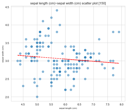
ScatterPlotting(x = iris_df['sepal length (cm)'], y = iris_df['sepal width (cm)'],
x_name = 'sepal length (cm)', y_name = 'sepal width (cm)',
save_path = 'E:/', input_figsize = (7, 6),
input_ssize = 50, input_alp = 0.5, input_fontsize = 8)
[Dataset Load]
from sklearn.datasets import load_iris
# Load Iris Data
iris = load_iris()
# Creating pd DataFrames
iris_df = pd.DataFrame(data= iris.data, columns= iris.feature_names)
target_df = pd.DataFrame(data= iris.target, columns= ['species'])
def converter(specie):
    if specie == 0:
        return 'setosa'
    elif specie == 1:
        return 'versicolor'
    else:
        return 'virginica'
target_df['species'] = target_df['species'].apply(converter)
# Concatenate the DataFrames
iris_df = pd.concat([iris_df, target_df], axis= 1)
print(iris_df)
sepal length (cm) sepal width (cm) petal length (cm) petal width (cm) \
0 5.1 3.5 1.4 0.2
1 4.9 3.0 1.4 0.2
2 4.7 3.2 1.3 0.2
3 4.6 3.1 1.5 0.2
4 5.0 3.6 1.4 0.2
.. ... ... ... ...
145 6.7 3.0 5.2 2.3
146 6.3 2.5 5.0 1.9
147 6.5 3.0 5.2 2.0
148 6.2 3.4 5.4 2.3
149 5.9 3.0 5.1 1.8
species
0 setosa
1 setosa
2 setosa
3 setosa
4 setosa
.. ...
145 virginica
146 virginica
147 virginica
148 virginica
149 virginica
[150 rows x 5 columns]
[Iris Dataset 모든 컬럼 간 산점도 그려보기]
from itertools import permutations 를 이용해
cols 리스트에 포함된 4개 컬럼으로 생성 가능한 모든 순열(4P2)의 경우의 수를 만들고,
cols_combination 에 저장한 뒤 이를 하나씩 불러와서 모든 산점도를 그려보는 코드이다.
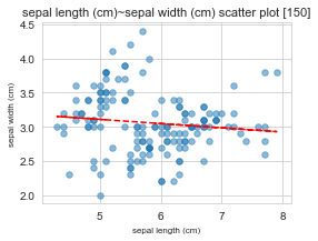
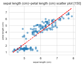
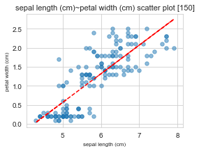
12회 반복해서 실행할 예정이므로 그림 사이즈를 작게 설정했다. (input_figsize = (4, 3))
from itertools import permutations

cols = ['sepal length (cm)', 'sepal width (cm)', 'petal length (cm)', 'petal width (cm)']
cols_combination = list(permutations(cols, 2))

for col in cols_combination:
    print("="*50, "\n",
          "x : ", col[0], "/ y :", col[1])
    ScatterPlotting(x = iris_df[col[0]], y = iris_df[col[1]],
                        x_name = col[0], y_name = col[1],
                        save_path = 'E:/', input_figsize = (4, 3),
                        input_ssize = 30, input_alp = 0.5, input_fontsize = 8)
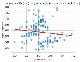
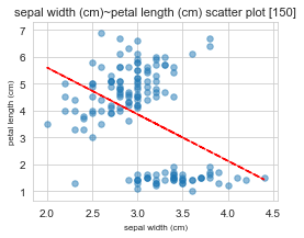
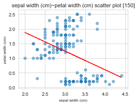
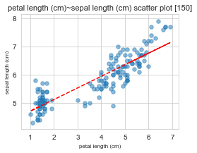
[실행 결과]
==================================================
 x :  sepal length (cm) / y : sepal width (cm)
==================================================
 x :  sepal length (cm) / y : petal length (cm)
==================================================
 x :  sepal length (cm) / y : petal width (cm)
==================================================
 x :  sepal width (cm) / y : sepal length (cm)
==================================================
 x :  sepal width (cm) / y : petal length (cm)
==================================================
 x :  sepal width (cm) / y : petal width (cm)
==================================================
 x :  petal length (cm) / y : sepal length (cm)
==================================================
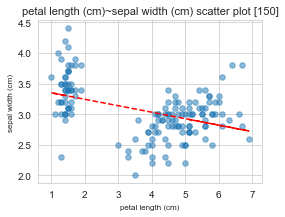
x : petal length (cm) / y : sepal width (cm)
==================================================
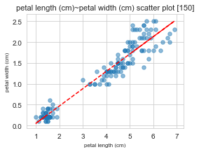
x : petal length (cm) / y : petal width (cm)
==================================================
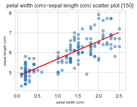
x : petal width (cm) / y : sepal length (cm)
==================================================
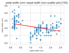
x : petal width (cm) / y : sepal width (cm)
==================================================
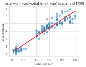
x : petal width (cm) / y : petal length (cm)
[R2 score Plot 위에 추가]
import numpy as np
import matplotlib.pyplot as plt
import pylab
from sklearn.metrics import r2_score

def ScatterPlotting(x, y, x_name, y_name, input_figsize=(7, 6),
                    input_ssize=30, input_alp=0.5, input_fontsize=8):
  # Calculate the trendline
  z = np.polyfit(x.tolist(), y.tolist(), 1)
  p = np.poly1d(z)

  # Calculate the R2 score
  y_pred = p(x)
  r2 = r2_score(y, y_pred)

  plt.figure(figsize=input_figsize)

  plt.grid(True)
  pylab.plot(x, p(x), "r--")  # Plot the trendline in red dashed line

  plt.scatter(x=x, y=y, s=input_ssize, alpha=input_alp)

  # Add the R2 value as text on the plot on the right-lower side
  plt.text(0.75, 0.9, f'R2 Score: {r2:.4f}',
  			transform=plt.gca().transAxes, fontsize=input_fontsize * 2)

  plt.title(f'{x_name} ~ {y_name} scatter plot [{len(y)}]', fontsize=input_fontsize * 1.4)
  plt.xlabel(x_name, fontsize=input_fontsize)
  plt.ylabel(y_name, fontsize=input_fontsize)
  plt.show()

# Example usage
ScatterPlotting(x=iris_df['sepal length (cm)'], y=iris_df['sepal width (cm)'],
                x_name='sepal length (cm)', y_name='sepal width (cm)',
                input_figsize=(7, 6), input_ssize=50, input_alp=0.5, input_fontsize=8)
반응형
'Data Analysis > visualization' 카테고리의 다른 글
| [번역] 모든 데이터 과학자가 시각화 툴킷에 추가해야 하는 8가지 대안 (0) | 2023.11.22 |
|---|---|
| [python] 데이터프레임에서 수치형 컬럼 자동 선택 후 그룹별 박스플롯 그리기! (feat. seaborn) (0) | 2022.04.27 |
| [python] 데이터프레임에서 수치형 컬럼 자동 선택 후 히스토그램 한 판에 그리기! (feat. seaborn) (0) | 2022.04.26 |
| [Python] y축 2개를 이용한 산점도 + 추세선 그리기(그룹별 색상 옵션 추가) (0) | 2022.02.11 |
| [Python] y축 2개를 이용한 산점도 + 추세선 그리기(&그룹별 색상) (0) | 2022.02.10 |


